Crowd QA Platform
As a Product Designer at Global App Testing, a start-up which offers crowd-sourced QA testing, I helped design their new SaaS platform from scratch, which was taken to market during my time there. The platform allowed customers to test their apps on demand by launching tests themselves from our UI to our crowd of QA testers. Customers can then receive results within the platform, which they can review and export to their bug-tracking tools.
My role in this project included working closely with the product manager to conduct research in order to better understand and analyse user pain points and problems, and using this research data to create and iterate on an MVP based on quantitative data.
Here is a case study of one of the post-MVP projects I worked on.
Background
After the creation of the MVP, we heard from customers that one of the pain points experienced in the QA process was the time it takes customers to triage issues (bugs) found within their apps. We knew this was an important problem area to focus on because our research showed QA teams were often under-resourced and experienced a lot of time pressure, so this pain point exacerbated wider problems in QA.
Our hypothesis was that making it quicker and easier for QA teams to triage issues found by our testers would help our customers to process and fix those issues, and therefore allow for quicker releases.
Team
Project Objective & My Role
The objective of the project was to facilitate an effective triage process by implementing a simple issue workflow to:
- Enable an easy and quick triage flow within our platform
- Hide rejected issues from the main issues view
- Make the triaging process highly visible to help team communication
We also wanted to track the issue acceptance rate to monitor both the issue reporting quality and the adoption of the triaging functionality.
My role was to lead the design of this project. I worked with the Product Manager in the discovery phase from the beginning, speaking to customers to ascertain the most important pain points in their triaging process. I collaborated with the Product Manager and Tech Lead to design the first iteration of the solution, which included workshopping ideas and creating concept mock-ups through to clickable prototypes. I tested wireframes and prototypes with customers before finalising the designs. Having monitored the data and usage of the feature, I then identified improvements that could be made in the second iteration of the design.
Main Customer Pain Points
After interviewing customers, target customers and non-customers in the QA space, we identified a number of pain points around results triaging issues.
Triaging issues is time-consuming
Currently it takes 30-60 mins to triage results
We want to reduce our triaging time to less than 15 mins
Invalid issues mean we spend a lot of time triaging results
High reliance on exploratory testing means we have a lot of issues
We want to free up our testers' time so that they can focus on more impactful activities
QA can be a bottleneck to releasing
Triage overhead can be high
The faster issues can be triaged, the faster developers can fix things
We have to triage the issues and then prioritise them, which can cause a delay in fixing issues
We don't want to send issues to developers unless we know they are valid issues
Communication during triaging is difficult
Someone coming to look at the issues list doesn't know which issues have already been rejected
We always have to put notes on our triage lists
We want to be able to mark a issue as 'already triaged'
Challenges
The way we were showing issues found by testers to our customers did not include any triaging functionality. We knew the result of this was that customers were spending up to 4 times as long triaging their results as they would like. We also knew what the main pain points were around triaging issues and we had a good understanding of the context and understood the risks and negative consequences of a bad triaging flow. In light of this, the Product Manager and Tech Lead and I workshopped:
- What might be the simplest way to introduce a triaging workflow so that we can speed up the triaging time?
- Can we achieve this using the existing issues page view?
- Can we create an intuitive and easy-to-use triaging flow within the current technical constraints?
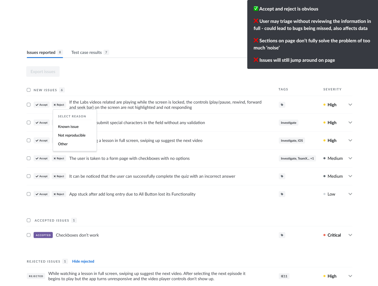
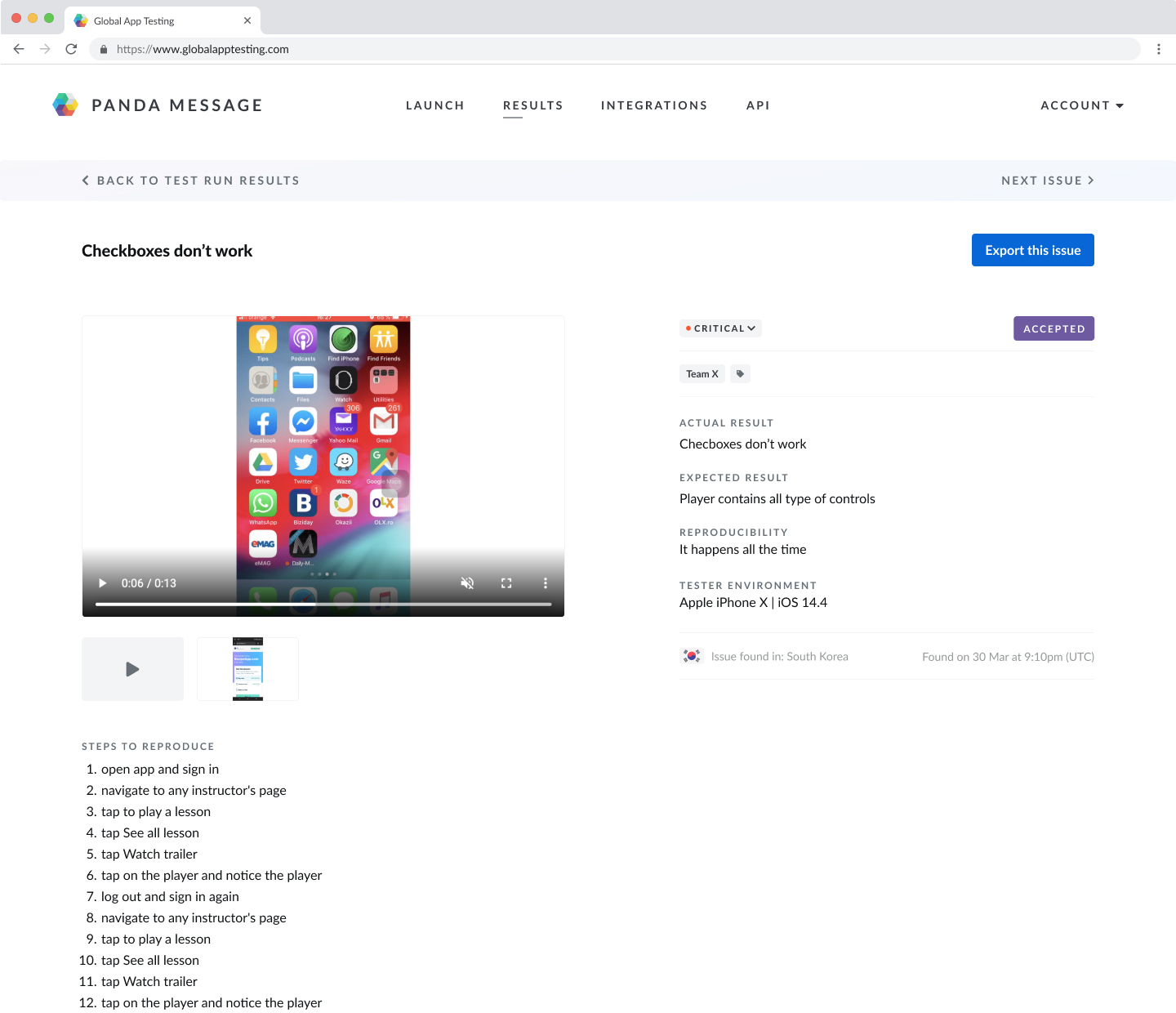
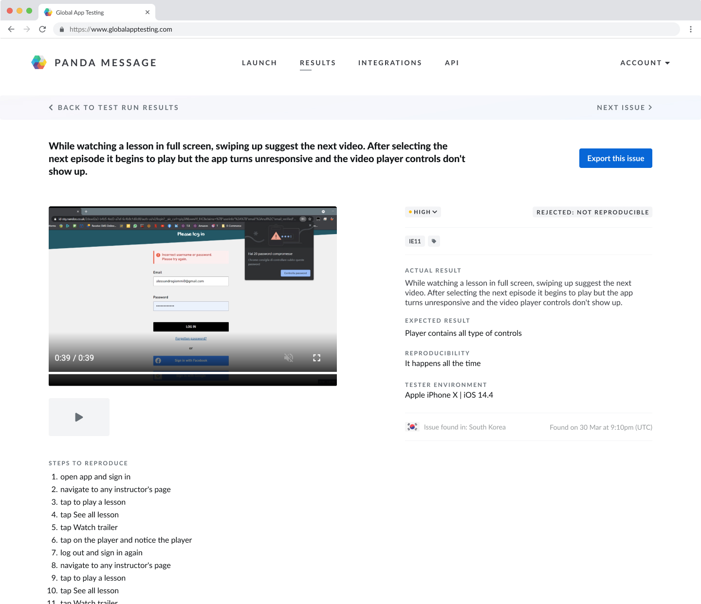
After a couple of rounds of brainstorming and voting on ideas, we decided that an accept/reject button for each issue would be a quick way to solve the customers' problems - it would allow them to hide rejected issues, communicate the triage status of issues to others in their team and be a first step towards enabling better issue triaging.
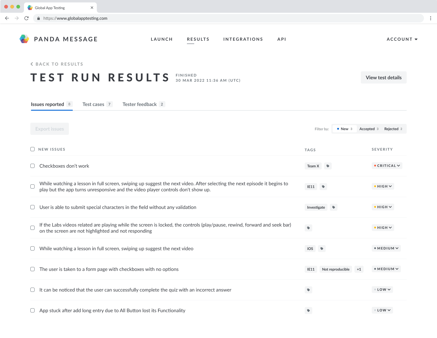
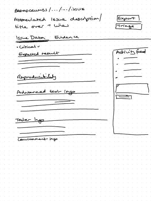
This was a change that could be made reasonably quickly in the code, however we were concerned that it would cause problems if we introduced it within the existing design, which showed the issues in an expandable accordion view. Adding the option to accept/reject issues within this already information-heavy view would cause various problems which might actually slow down the triaging process and be detrimental to the user experience.
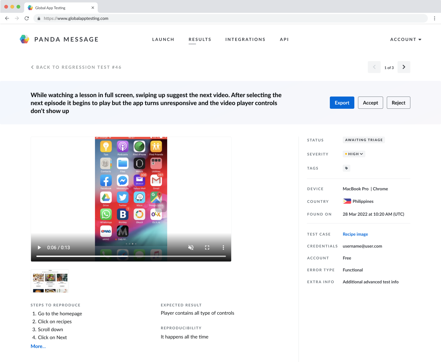
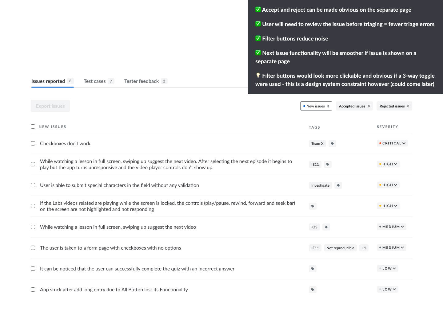
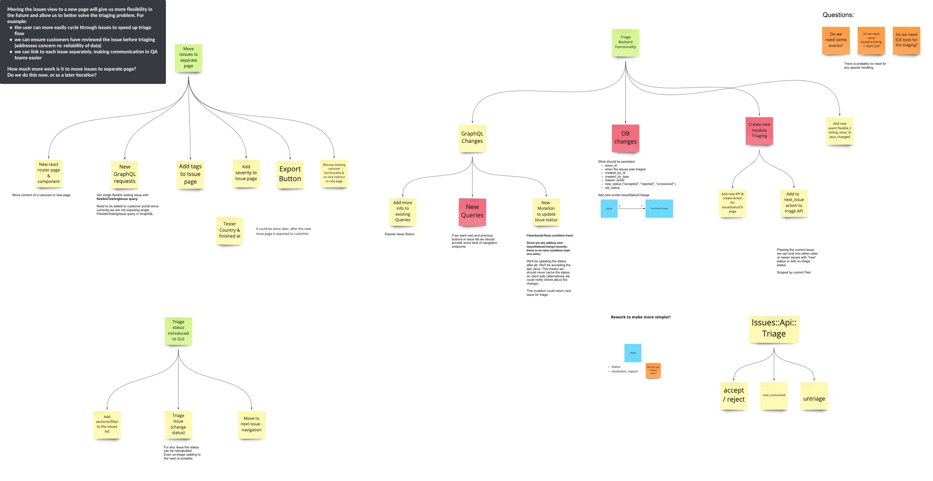
After exploring some potential solutions within the existing view, we realised it would be better to change the structure of the page to allow us to better solve the problem for the customer. The options we had within the existing page did not effectively solve the customers problem, so we decided to move away from the accordion view and show each issue in its own page. The next step was to scope out this work with the full engineering team so that we could gain an understanding of how much more work this would be to implement.
Initial designs to explore the solution within our existing page structure
Exploring changes to page structures
Design Phase
After fully defining the problem and working through the technical constraints with the engineers, we defined the requirements for the first iteration of the triage flow as:
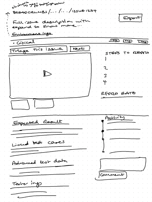
- The layout will be restructured so that each issue is shown on an individual page
- The issues list should be filterable so that users can avoid seeing the 'noise' of rejected issues, making it easier for them to focus only on the valid issues
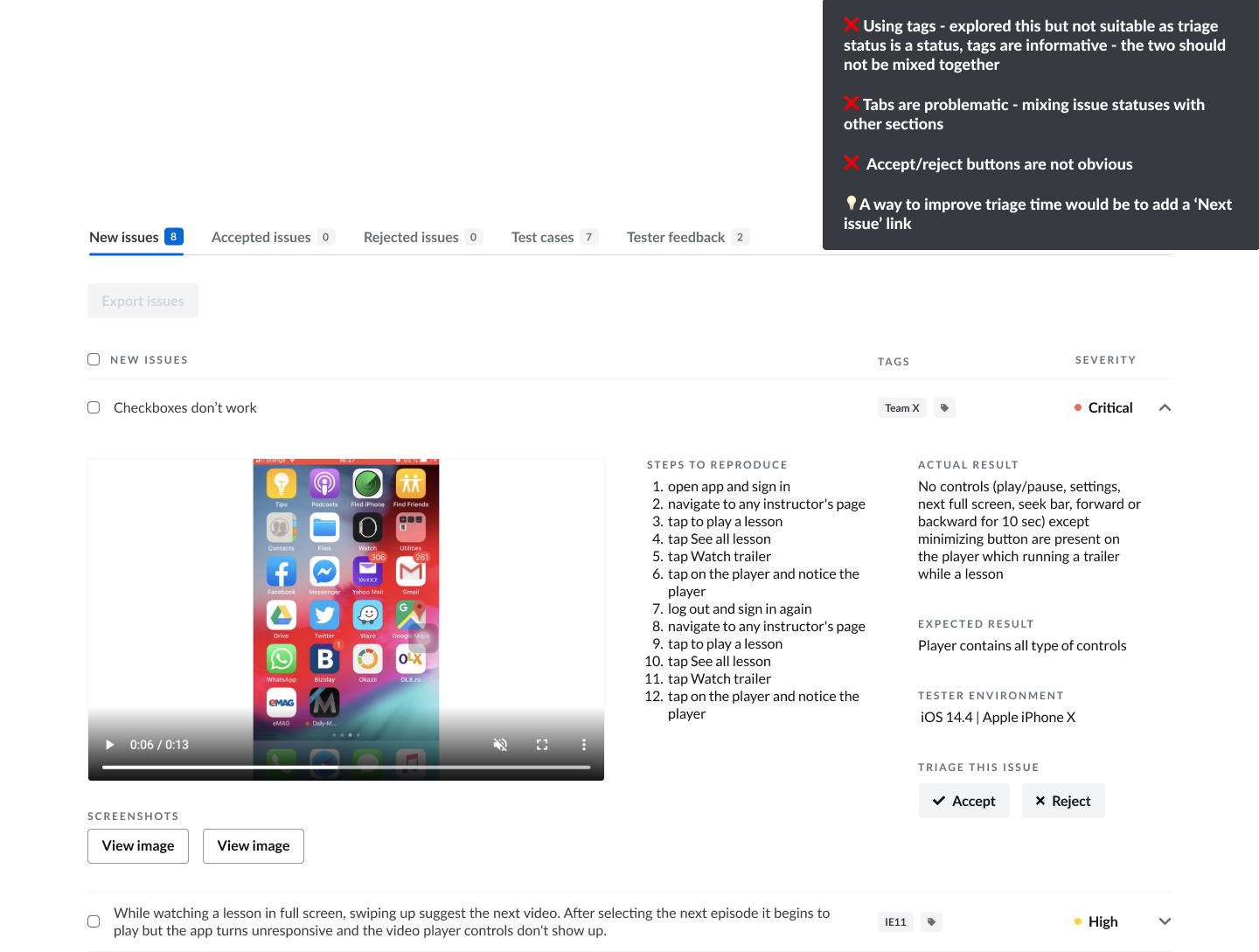
- Accept/reject buttons need to be highly visible, easy to click, and it needs to be clear to users what these terms mean - we need to test this with users
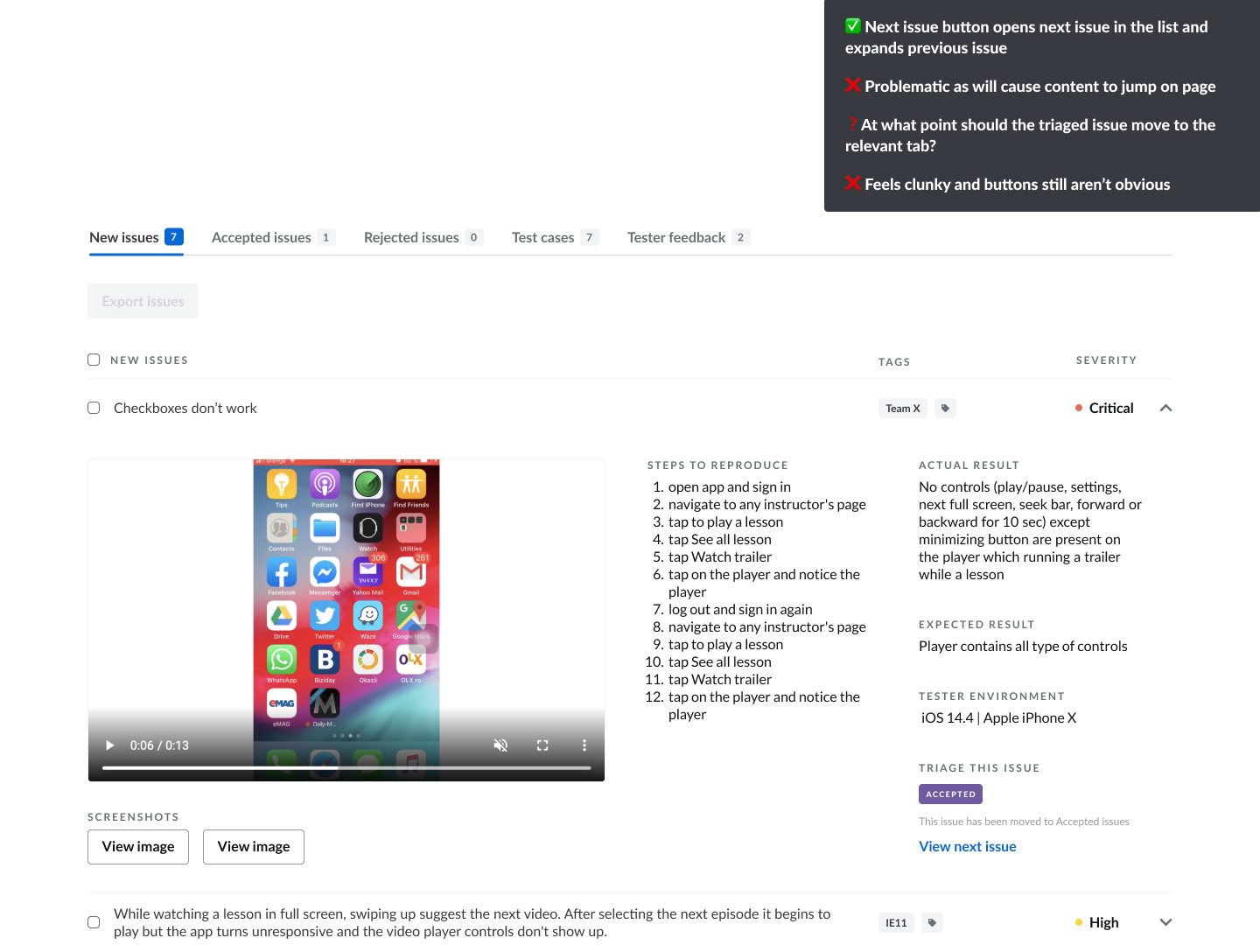
- Ideally, users could easily navigate to the next issue in the list within an individual issue view to speed up the triage flow
- The reason for rejecting a issue should be shown in the UI. We can use the data we have on tag usage to find out the most common reasons a issue is not valid
We also had the following constraints:
- Use components within the existing design system to help speed up implementation
- Layout changes for the issue information should be kept to a minimum to keep the migration of issues to a separate page simple to implement
- Allowing the user to navigate back to a previous issue is out of scope due to complexity
Initial sketches of the solution
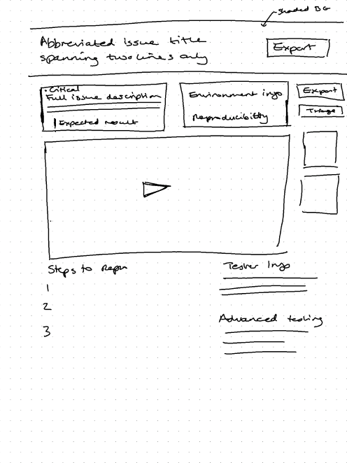
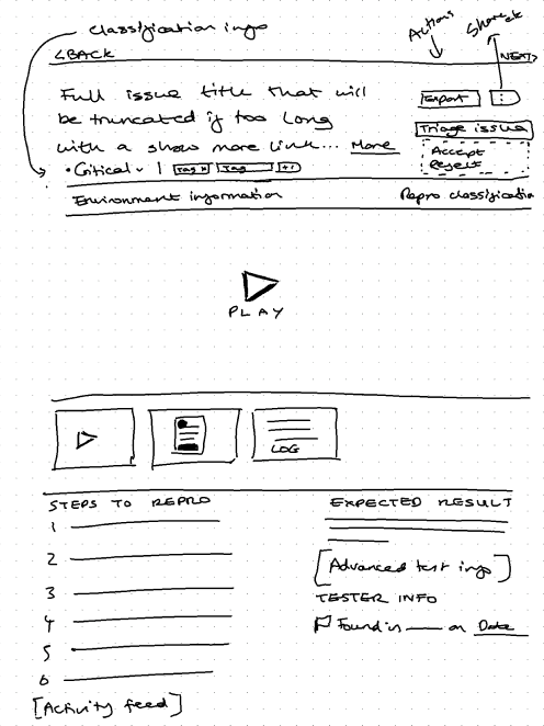
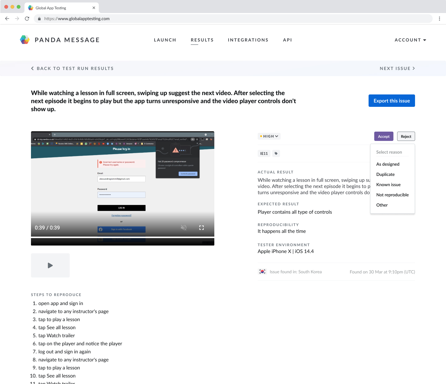
Final Designs
Data
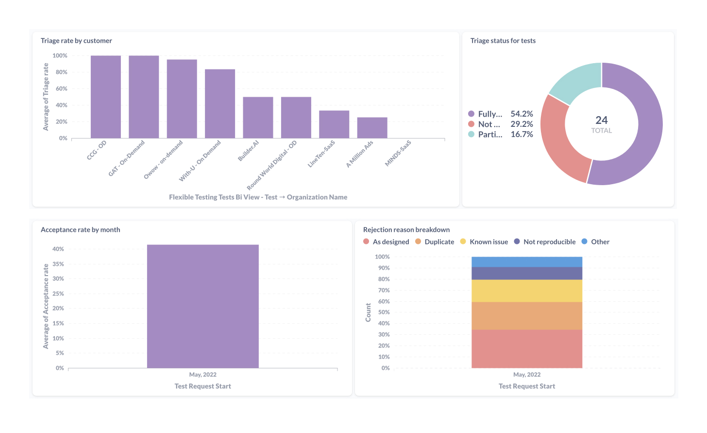
We monitored the adoption and usage of the triaging feature over the following month and found the following:
- 70.9% of all tests run included at least some issue triaging
- Customers who launched the most tests had the highest adoption rates
- Most rejected issues were for the reasons 'as designed' and 'duplicate'
- No customers were using the 'next issue' button
Reflections & Further Iterations
The data and feedback from our customers showed that some improvements could be made to the triage flow to make the triage process even quicker and easier, and to further increase adoption rates:
- Accept and reject buttons could still be more obvious (this came from customer feedback and also from viewing HotJar recordings)
- The 'next issue' button needs to be more prominent
- Layout improvements would create better visual hierarchy
- Showing number of issues remaining in the 'not triaged' lists would help users understand how far through the triaging process they are
- Disabling the export button unless an issue is accepted may improve adoption rate and prevent exports of rejected issues in error
Here is my updated design which addresses some of the above points. As this was a recent project, I have not yet been able to monitor the impact of the new design as we do not currently have enough customer data.