KPMG Dashboard Design
In my role at KPMG, I designed B2B ‘voice of the customer’ dashboard solutions which helped insight experts and managers analyse complex data to understand customer satisfaction levels and pain points.
I worked with the product owner and the development team lead to develop the UX and visual design of features and components for the core product. The product was highly customisable and I also worked as the UX lead on projects to design and code the front-end for bespoke client implementations of the product.
Here are some of the projects I worked on during my time at KPMG (due to client confidentiality restrictions the branding has been anonymised).
Background
Our client was in the airline industry and was struggling to gain in-depth insight into their customer journeys and satisfaction levels using their existing insights dashboard. Their existing dashboard was too simplistic and did not meet the needs of the many different user groups - users were not able to drill-down into the data to get the information they needed, nor did the dashboard provide a sufficient overview for users who needed a high-level snapshot of their team's performance.
We designed and built a new dashboard from scratch, focusing on addressing the differing needs of each user group.
Team
My Role
As the UX/UI lead for the project I was responsible for the UX and UI design of the site, including:
- Collaborating with the client at scoping sessions to translate different user group requirements into usable designs
- Working with the data and insight teams to map the information architecture
- Leading the end-to-end design phase
- Building the front-end of the site and co-ordinating build tasks with the data team
Project Challenges & Outcomes
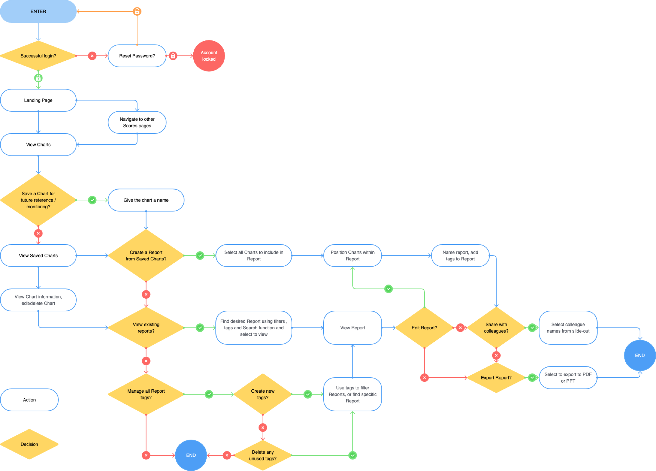
The main challenge on this project was designing for so many different user groups, each with varying requirements. To overcome this challenge, we mapped out different user flows and created unique sets of pages for each user group. User access to these pages would be controlled in the dashboard by assigned user roles and permissions. We consulted with representatives from the different user groups at the prototyping stage, gathering feedback as part of the iterative design process to ensure the needs of each user group were met.
The resulting dashboard included bespoke pages for five different user groups. In the second phase of development we added further sets of bespoke pages for 3 more user groups.
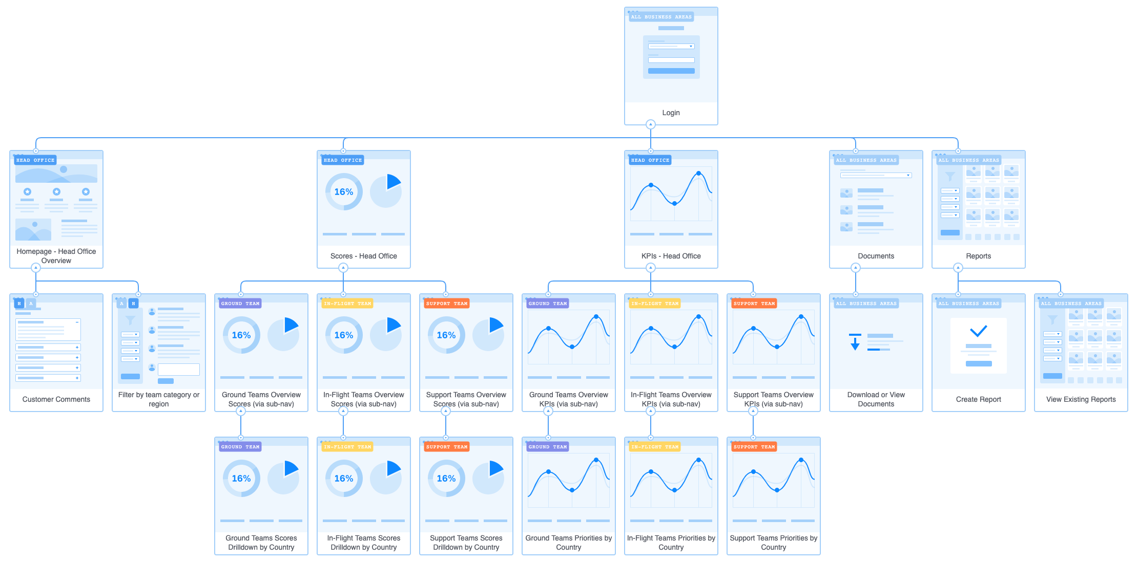
Journey Mapping & Information Architecture
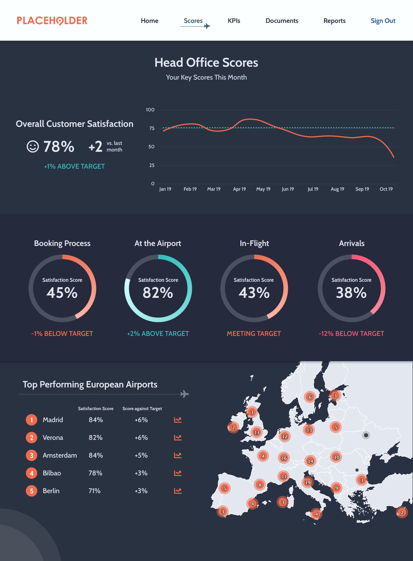
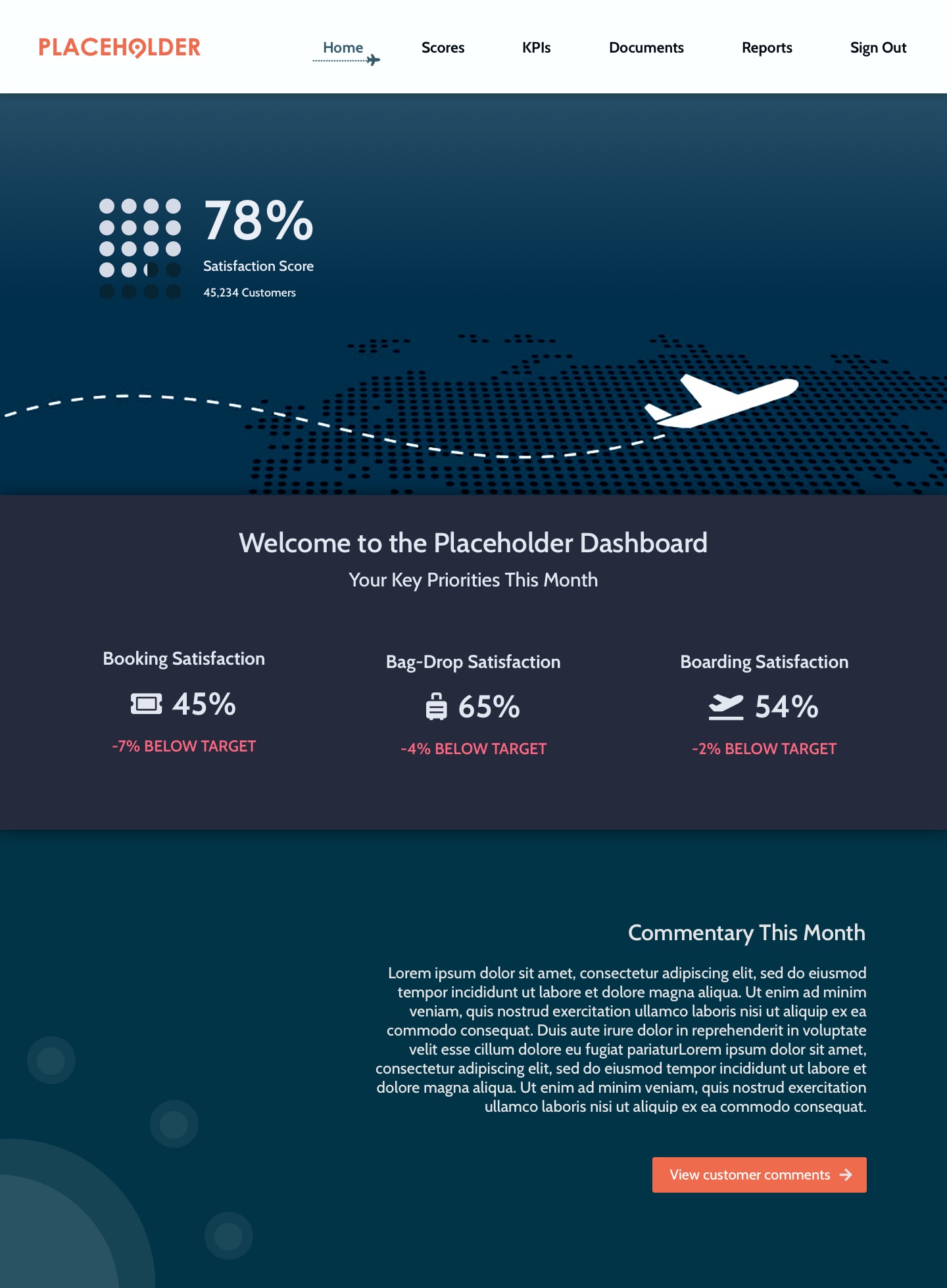
The purpose of the site was to enable the client insight team, managers and team leads to monitor their customer satisfaction scores against their targets, analyse customer experience data and prioritise actions accordingly.
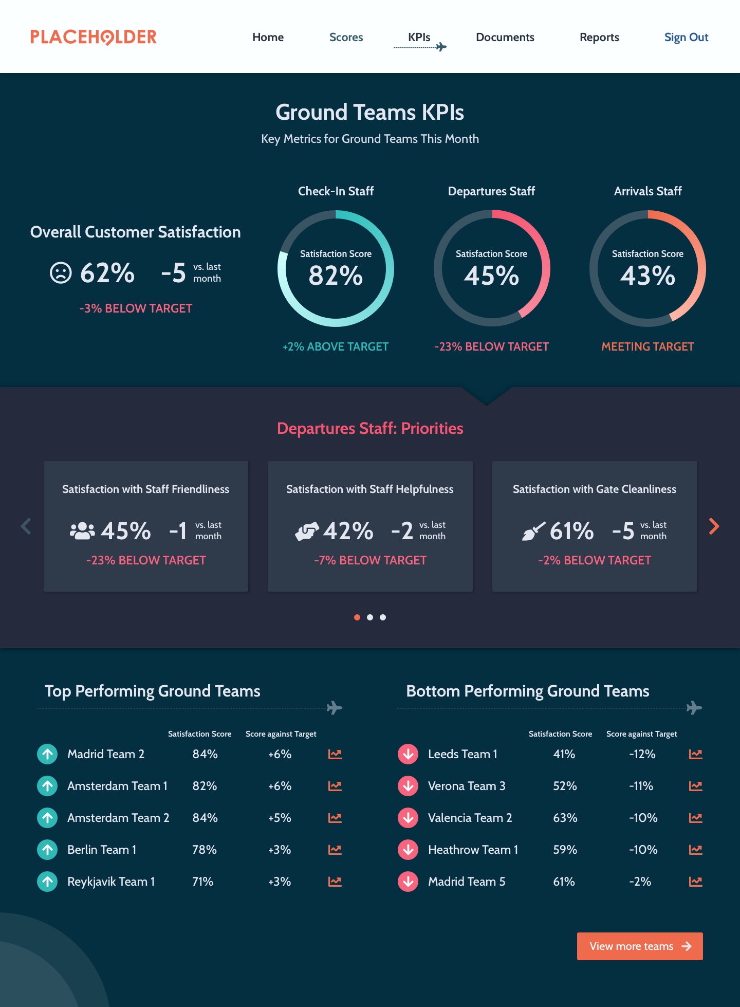
We identified that the site would primarily be intended for several different user groups, including Head Office staff reporting to the leadership team, staff managing ground operations teams and cabin crew managers.
Head Office staff
Role entails drilling down into data to report to leadership
Using mainly desktop
Goals
Report to management on high-level KPIs
Monitor key themes & overall business performance against targets
Identify priorities
Identify low-performing teams negatively affecting scores
Ground Team Leads
50/50 split between time in office and managing teams on the ground
Using combination of desktop and mobile
Goals
See snapshots of performance on-the-go, and drill-down into details when in the office
Monitor own team’s performance against targets
Identify where team’s performance is below standard of other teams
Create and cascade actions to improve low scoring areas
Cabin Team Leads
Travelling between hubs managing different teams
Using site on mobile
Goals
Monitor team’s performance against targets
Identify where team’s performance is below standard of other teams
Drill down into data, themes and comments to identify customer pain points
Create actions to improve low scoring areas
Cabin & Ground Staff
Extensive travelling, no access to an office
Using site on mobile
Goals
Monitor own performance against peers'
Identify specific mentions in customer comments
See overview of key themes from customer comments
See actions/tasks assigned by managers
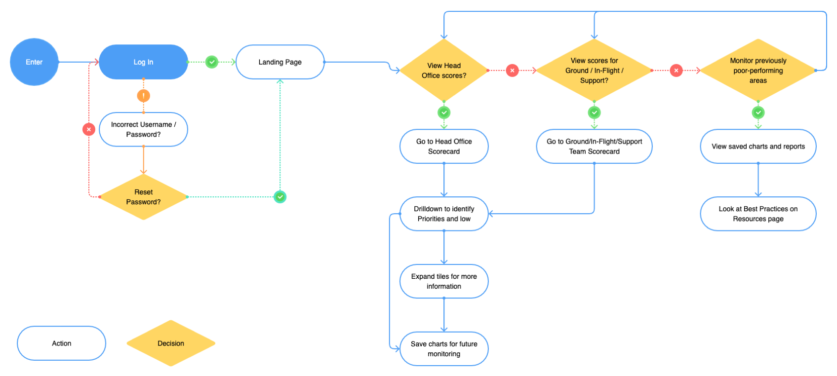
User Flow
Site Map
Design Phase
Using the user stories, I tailored pages to each user group with simple score-based views for the cabin/in-flight and on-the-ground users who needed to be able to quickly identify their performance against their targets whilst they were on the move, including how their scores compared with other teams and performance of their individual team members.
The Head Office and management level scores page designs were more complex, showing more detailed analytics and including the functionality for those users to see a high level overview with the option to drill down further into the data by clicking on links to view trended data, or clicking directly on metrics to view further data.
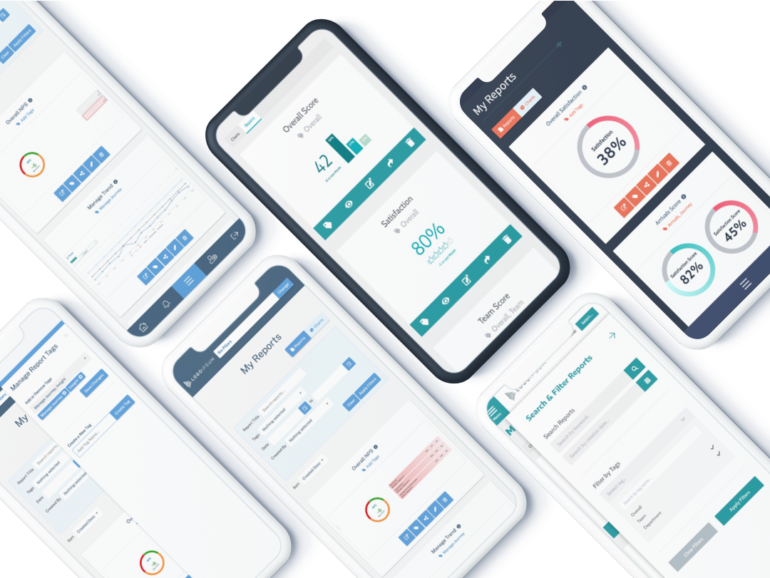
Around half of users in the user groups we identified would be accessing the site only on mobile devices as they were not office-based. I created mockups and wireframes for both mobile and desktop depending on the user group I was designing for, and sought and acted upon feedback from the relevant stakeholders before creating the final prototypes using Sketch and InVision.
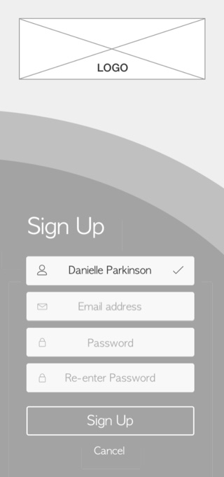
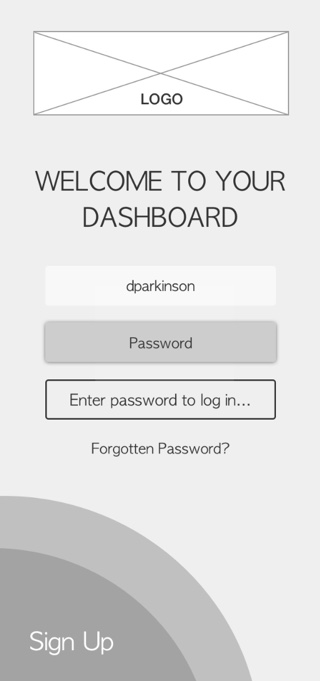
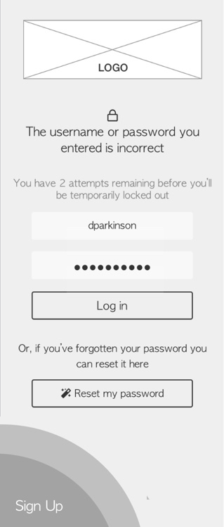
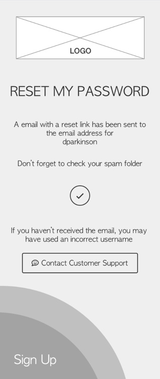
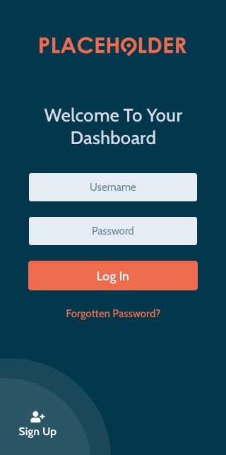
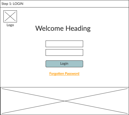
Mobile Wireframes: Sign-in Flow
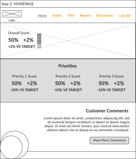
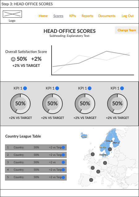
Low Fidelity Desktop Wireframes: Homepage and Scorecard Pages
Final Designs
Style Guide
Build Phase
I built the front-end of the site in two week sprints following Agile workflows. I co-ordinated with the data and insight teams during the build phase when building data visualisations.
HTML Bootstrap LESS jQuery Highcharts Library C#
Reflections
The design phase for this project was very lengthy due to there being a number of different sets of pages, each of which we received user feedback on. As a result it became quite difficult to manage the feedback in InVision, the prototyping tool we were using, as there were a number of different users adding comments to the pages relevant to them on the prototype. I gained good experience on this project in managing that user feedback, with the key learning points being to set a hard deadline for receiving the feedback and to collate the feedback before acting on any of it. This makes the process much more manageable in terms of both reviewing the feedback efficiently in one session and identifying common themes in order to prioritise if and how feedback points should be actioned.
In terms of the project output, the client has seen a large increase in the number of users logging on to their dashboard to monitor their scores compared to the number of logins on their previous dashboard. User feedback since launch has been very positive, with the dashboard extended to a number of additional user groups who requested similar designs and functionality to the existing pages.
Background
Working closely with product owners and developers, I designed modules and features for our core product.
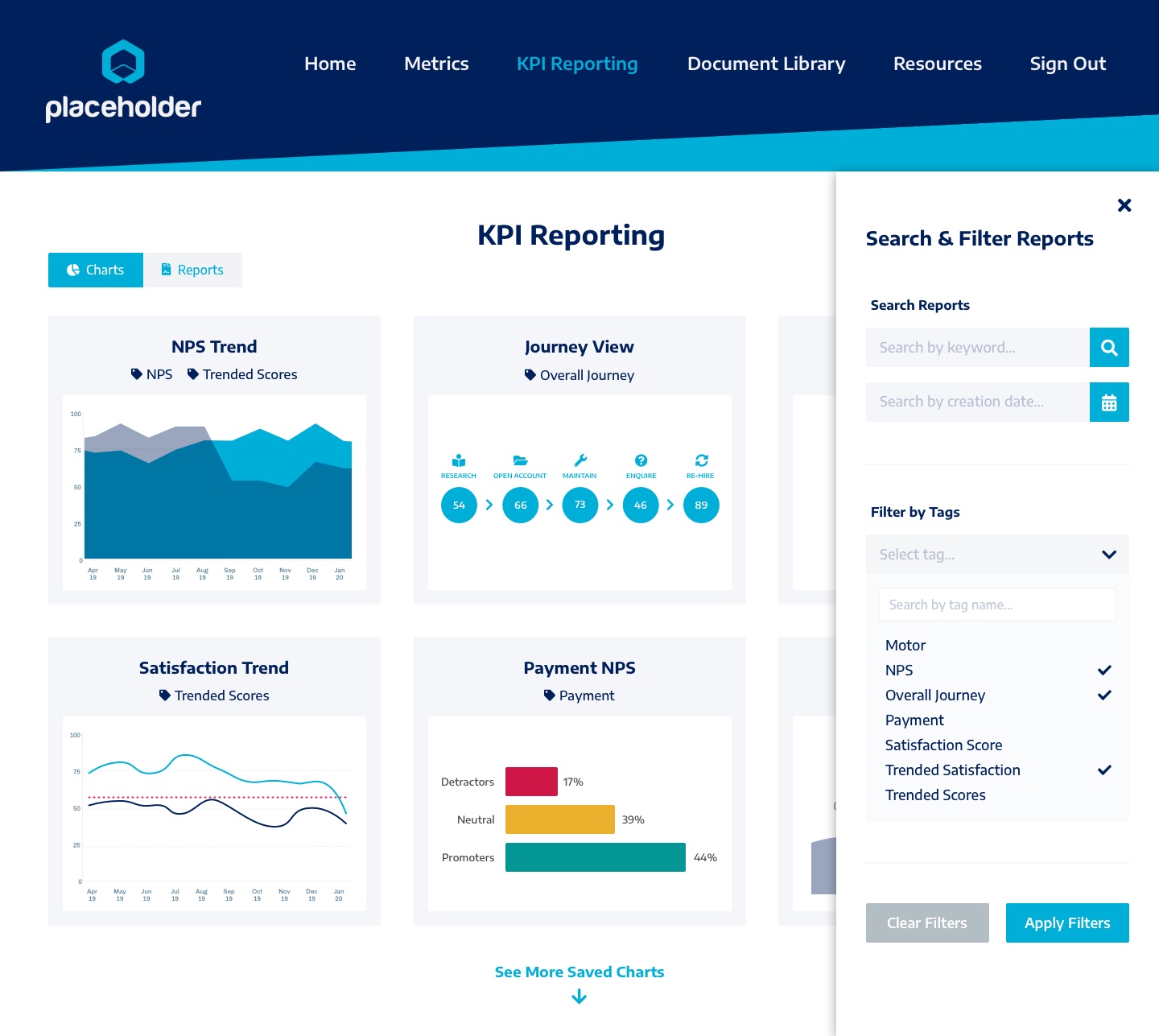
I recently worked with the product owners to develop new ideas and designs for a key reporting feature within the product, where users can save charts and other data visualisations as reports which they can later refer back to, share with other users and export.
Team
My Role
I was the sole UX Designer on the project, and was responsible for the end-to-end re-design. My responsibilities included:
- Reviewing the existing reporting module from a UX and design perspective
- Re-designing the reporting module, taking a user centred and component-based approach
- Working with developers to oversee the execution of the new functionality and my final designs. I was also responsible for styling the front-end in the build phase
- Creating a product release brochure and digital assets to be used in product sales pitches
Project Challenges & Outcomes
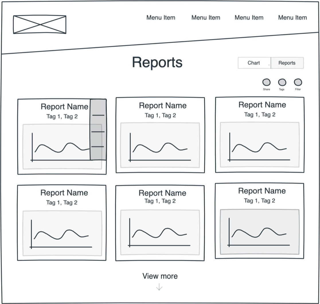
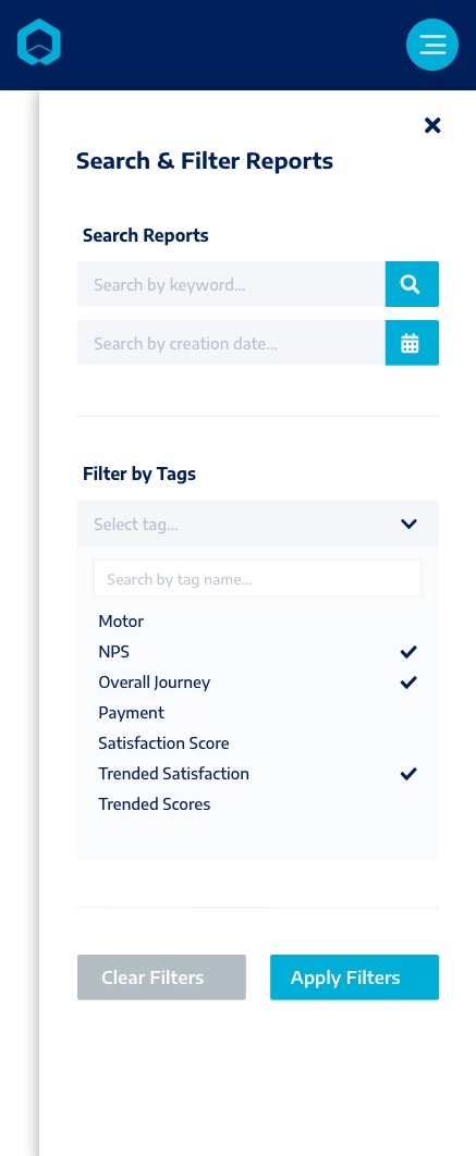
The original design was grid-based, with saved reports simply listed in a grid format. Qualitative user feedback indicated that users found this grid difficult to filter and search, making it difficult to find reports they had previously created. I focused on creating a more visual, clean UI with a clear and intuitive search and filter component.
User Stories and User Flow
Senior Manager / Insight Team Lead
Largely office based
Reporting regularly on the same KPIs
As a senior manager I want to...
Create a report containing key charts so that I can present that data to the leadership team at meetings
Access previously created reports which have automatically updated with new data so that I can re-use those reports
Export charts and reports to PowerPoint and PDF so that I can use them in my presentations
Team Lead / Manager
Largely office based
Regularly viewing specific charts
Regularly creating and sharing new reports
As a team lead I want to...
Filter saved charts so that I can create custom reports from selected charts
Filter previously created reports so that I can review specific reports to monitor my team's performance
Share reports I have created so that I can update senior management on my team's performance
Team Member
Split between office-based users and those moving between locations
Tracking own performance rather than reporting to leadership
As a team member I want to...
Review my key performance data so that I can track my performance over time
Share reports with my manager so that I can provide evidence of changes in my performance
User Flow
Ideation and Design Phases
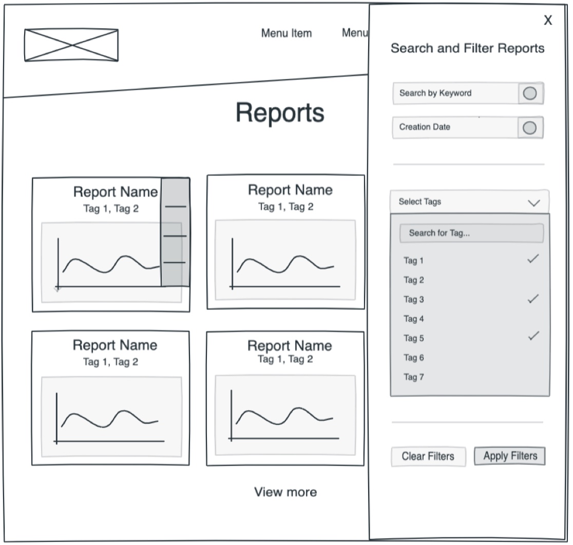
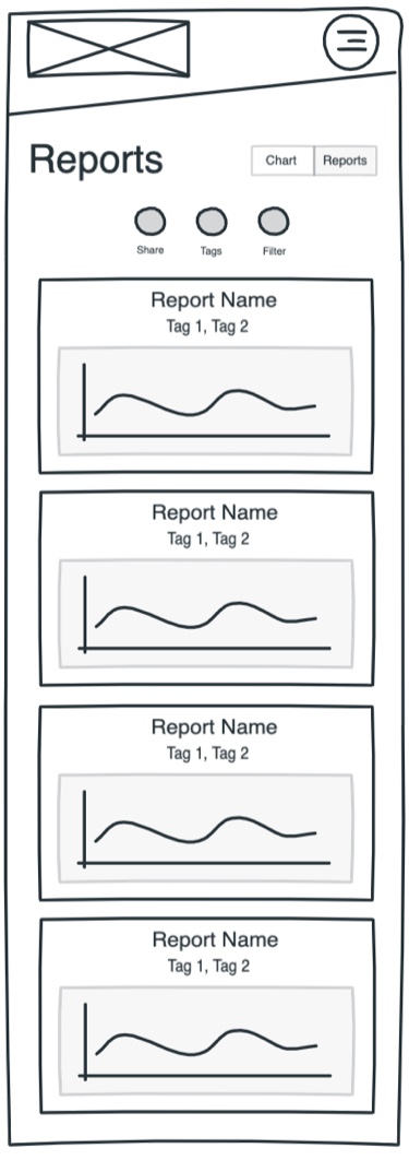
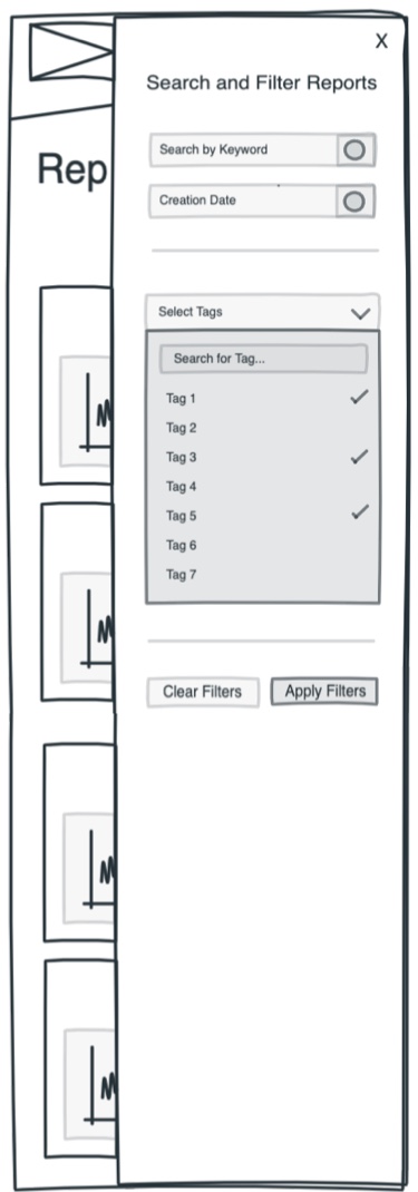
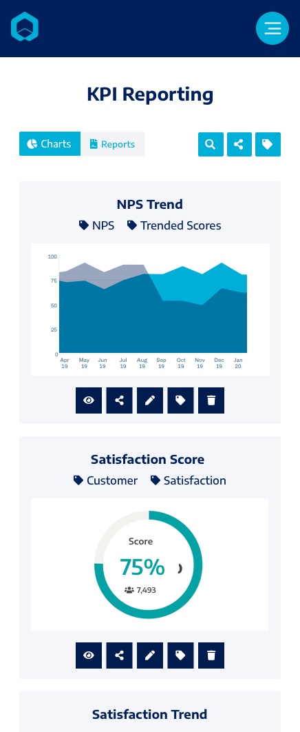
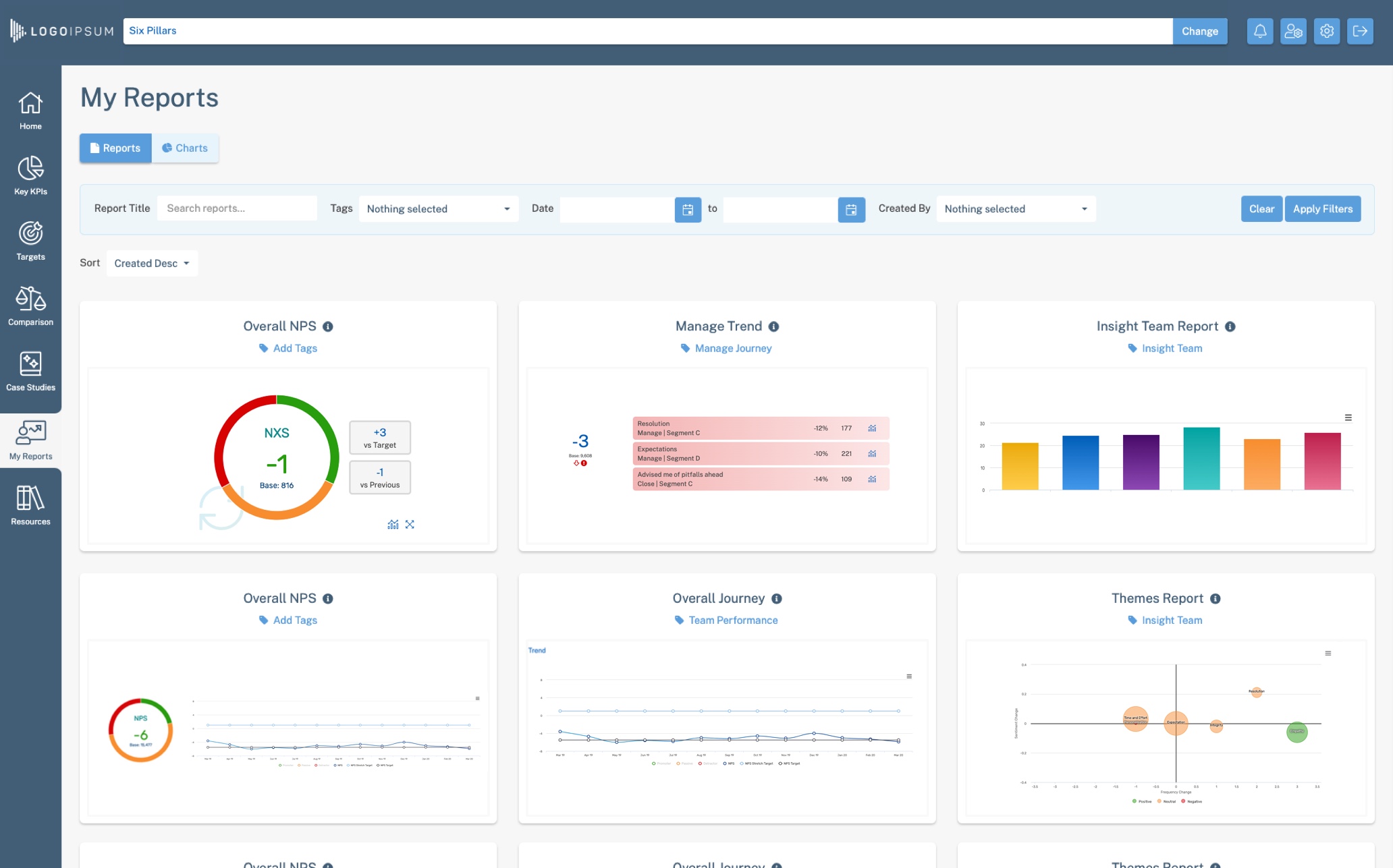
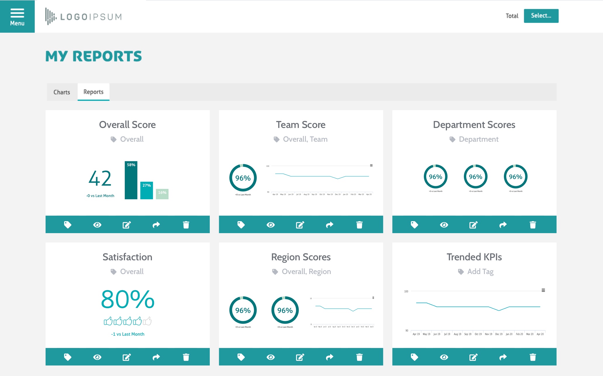
In the re-design, I moved towards a more visual, tile-based approach where users would be able to see a thumbnail of the previously saved report so they would not have to rely on remembering the name of the report to find it again. I also incorporated slide-out panels into the design to allow users to easily filter and search for reports and I added tag functionality to allow users to tag reports so that they could view selections of reports on similar metrics.
As the user flow for the reporting component is quite complex, I simplified the options available to the user by designing each report tile to be interactive, with a list of options (edit, view, share etc.) available on hover.
My main aim with this re-design was to make the reporting page less overwhelming for the user, more intuitive and visually appealing. Showing only 6 reports at a time encourages the user to filter the reports by tags and keywords to find what they need, rather than scrolling through what was previously a large grid of report names.
Addressing User Pain Points
Finding Reports
Finding previously created reports in order to view up-to-date data for a selection of metrics
Solutions
Add tag functionality to allow users to create tags, add tags to reports and filter reports by tag
Include slide-out panel with filter and search functionality
Option to sort reports by date created
Viewing & Downloading
Having filtered to find a report, viewing report information to make sure it is the correct report before downloading
Solutions
Include a report information slide-down panel on each report thumbnail detailing date last edited, number of charts and if the report has been shared
Include a 'quick download' option to allow users to download a report from the thumbnail view, without needing to open the report itself first
Sharing Reports
Sharing reports, and selections of reports, with other users.
Viewing and editing reports that have been shared with them.
Solutions
Include a slide-out panel to share a report from the main reports page
Include multi-select functionality to share reports with multiple users at once
Add option to share multiple reports by tag
Automatically tag reports shared with a user as "shared with you" so that the user can filter by shared reports only
Desktop Designs
Mobile Designs
Client Implementations of the new Design
Following the re-design of the reporting component, we have incorporated the re-designed feature and new functionality in several bespoke client projects.
Build Phase
I worked closely with a senior product developer to implement the new functionality, overseeing the implementation of the re-design and assisting with issues that arose throughout the build and QA phases.
I coded the front-end for the reporting feature using HTML, LESS and JavaScript.
HTML Bootstrap LESS JavaScript
Reflections
The main challenge on this project was to improve the visual design of the component without this being at the expense of hiding away functionality and available options. We knew from feedback that the users found the previous grid-based design difficult to filter and that it was overwhelming to be faced with a grid of named reports when trying to find a specific one (especially as this relied on the user naming their reports in a logical and consistent way). One of my main considerations when re-designing the component was to make sure that it was intuitive - there was already a lot of functionality on one page (e.g. the options to filter, share, export, tag, view, edit, rename and delete reports) and I didn't want to re-design the component to look less overwhelming and more visually appealing, but lose visibility of the functionality - it was important that the user was still able to easily see all of the options available.
Through creating a thorough prototype, which covered all aspects and functionality of the reporting component, I was able to be confident that my designs covered all parts of the user flow and that each part was designed in a way that made the available functionality obvious. As I took a component-based approach to designing the reporting component, the solution I found to the problem of needing to show a lot of options on one page was through slide-out panels containing, for example the filtering and tagging functionality. The slide-out panels were a constant throughout every page within the reporting component, meaning that the user experience was consistent and predictable.
Background
The stakeholder specification was to design and implement a mobile-friendly dashboard which would allow management and insight professionals to easily monitor the bank's performance against its KPIs in relation to customer satisfaction and the customer journey.
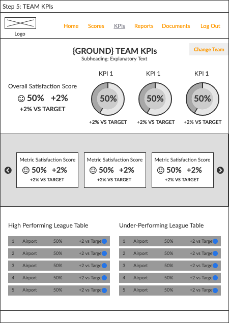
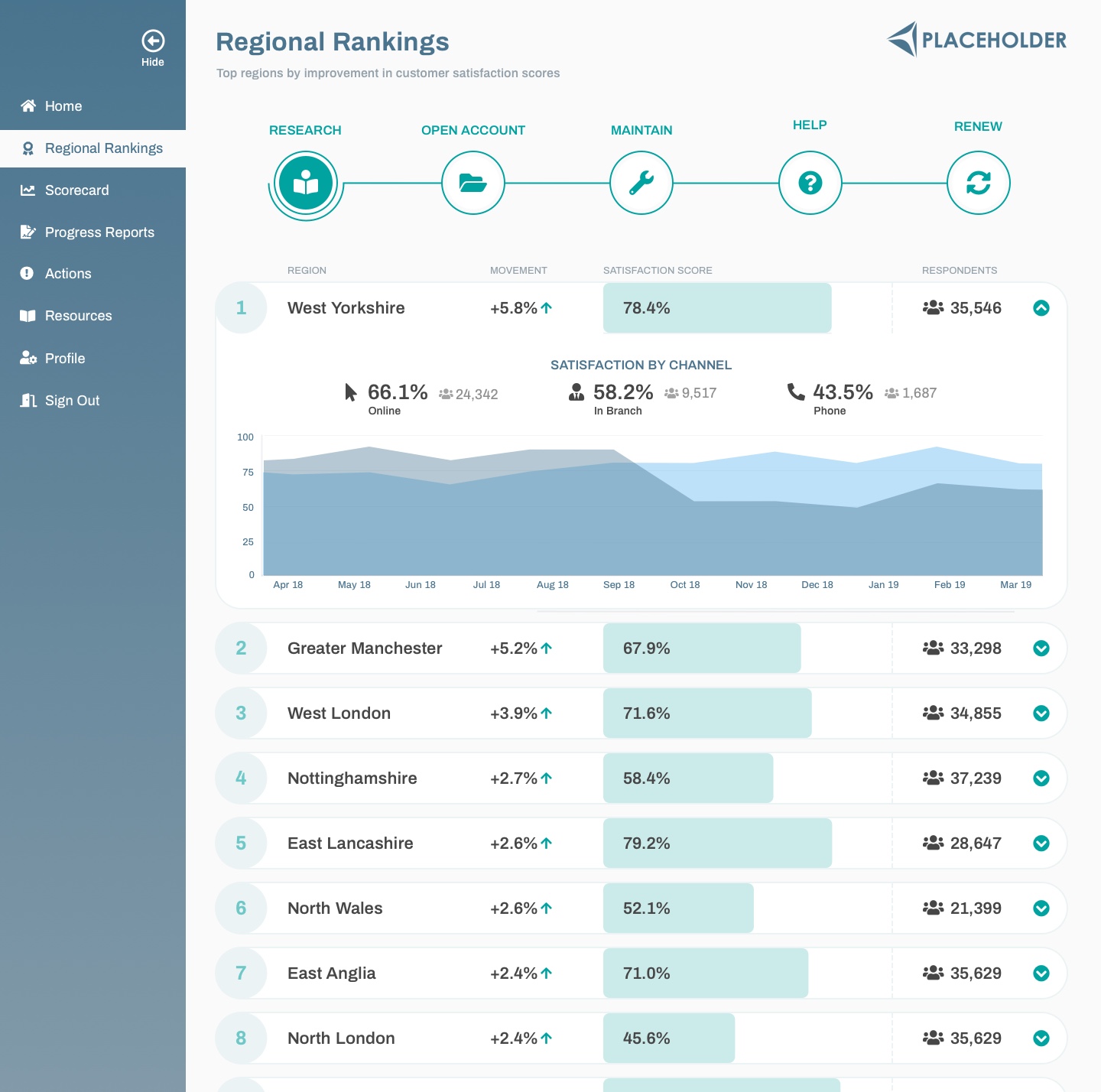
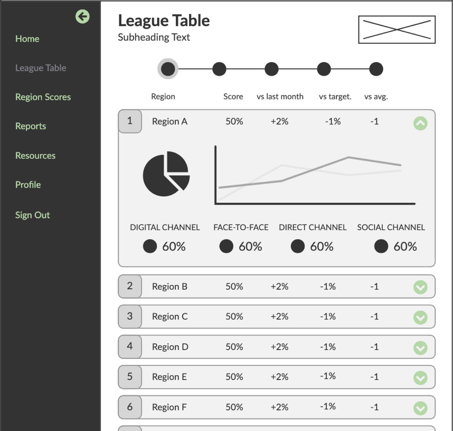
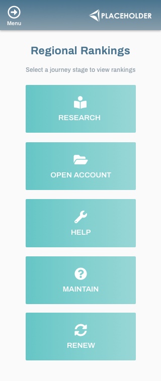
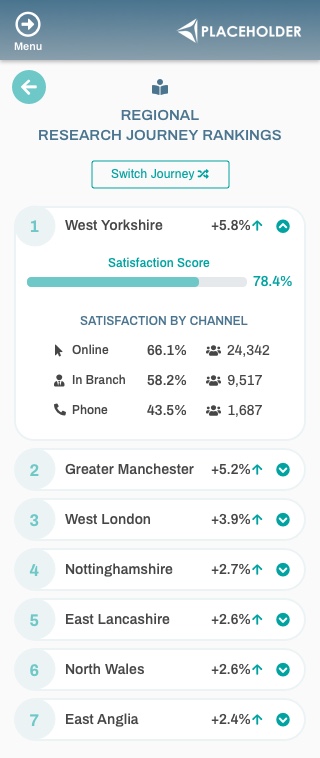
A key part of the design was a league-table-style regional rankings page, showing the top performing regions by customer satisfaction score, with the option to view details of best practices followed in those regions to drive improvement across the whole business.
Team
My Role
As one of the UX Designers on the project, my role included:
- Working with the client and the insight teams to put together the information architecture and specifications for the site
- Translating sketches and ideas from the client scoping and ideation sessions into wireframes and clickable prototypes
- Iterating on designs and working with the data and insight teams to put together site content schematics
- Building the front-end of the site and co-ordinating build tasks with the data team
Project Challenges & Outcomes
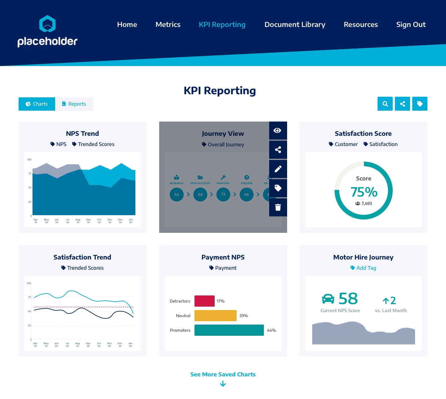
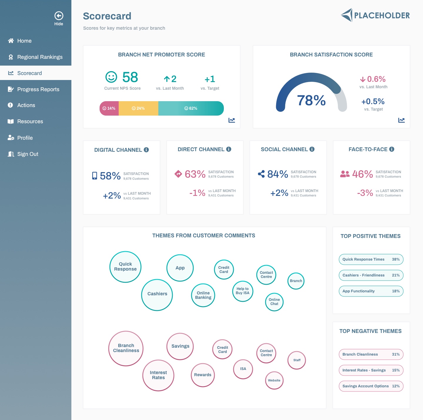
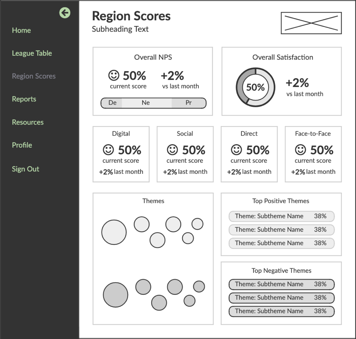
The design challenge on this project was to take a large amount of complex data and display it in a user-friendly and easy-to-process way. I used a combination of data visualisations and simple score-based tiles to create a clear visual hierarchy, for example on the scorecard page I used bold data visualisations for the key information on the page to allow users to quickly process the headline metics, with more subtle score-only tiles for the less important metrics to reduce cognitive load.
User Stories and Tasks
User Tasks
User Tasks
User Tasks
Ideation and Design Phases
Once we had identified the key user groups and created the information architecture for each group, I worked with the client stakeholders and insight and data teams to scope what specific data and charts each user group would need to see on each page. The pages for the Regional Manager and Branch Manager were similar in terms of content, so I began by creating wireframes and mock-ups for those user groups, iterating and building on the designs following feedback from the insight and data teams and the client stakeholders.
My main aim with the league table design was to clearly show the regions ranked by satisfaction score, with the information that was most important to the Regional Manager being immediately visible. I split the rankings tables by journey stage to avoid the page becoming too complex or cluttered, reduce cognitive load and allow the user to get a snapshot view for each journey stage.
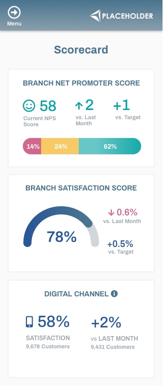
For the scorecard page, I prioritised the key user tasks for each user story and sought to make those tasks the easiest to accomplish in my designs. For example, the priority of a user visiting the scorecard page would usually be to check the region/branch's NPS and Satisfaction scores and compare these against the previous month. I used clear, bold data visualisations for these metrics to make them stand out and added colour-coding to show whether the performance had improved (green) or dropped (red) so that users could see the performance trajectory at a glance.
Below are the wireframes and designs for the league table and scorecard pages.
Low Fidelity Dashboard Wireframes
Final Desktop Designs
Final Mobile Designs
Build Phase
I worked with the data team to build the data visualisations for the site. I was responsible for building the front-end.
HTML Bootstrap LESS Highcharts Library jQuery
Reflections
The design of this dashboard is very simple due to the balance of data visualisations with more simple score-based views and in that respect addresses the challenge of reducing cognitive load.
In terms of next steps, I think the dashboard could be improved by adding more functionality and detail to provide the users with greater insights and more context for the data. A good way to achieve this, without compromising the clean, simple design, would be to include filtering functionality on each page. For example, to improve the league table page it would be useful for users to also see the bottom performing regions (e.g. by a toggle switch). It would also be useful on this page, to see a snapshot of the regional manager's region's scores, perhaps above the league table with details of the headline scores and the region's overall ranking to provide more context for the manager.