UX Diploma Coursework
As part of my Professional Diploma in UX Design at the UX Design Institute, I completed a comprehensive research and design project to design a flight booking flow from scratch for a fictional airline, "Fly UX".
The project focused on applying user-centered design methodology, from usability testing and empathy mapping to designing interaction flows based on qualitative data analysis. This helped me to build a strong foundation in evidence and research-based design.
Skills Demonstrated
Research & Analysis
As the first step in this projecct, I conducted a series of research activities to inform my design process, including:
Competitor Analysis
Analysed flight booking flows from multiple airlines to understand common patterns
Identified best practices and opportunities for improvement
Usability testing
Led moderated usability tests with users booking flights on competitor sites
Observed where they struggled, what they expected, and where friction occurred
Empathy Map
Created an empathy map from qualitative user data showing user goals.
Visualised behaviours, context, and pain points at critical points across the journey.
Affinity mapping
Grouped research findings into themes and patterns using affinity diagrams in Miro
Identified the most critical usability issues and organised them by journey stage
Key Findings
The research revealed several recurring problems. These insights became the focus of my designs and informed design decisions when defining the user flows and designing the UI later in the project.
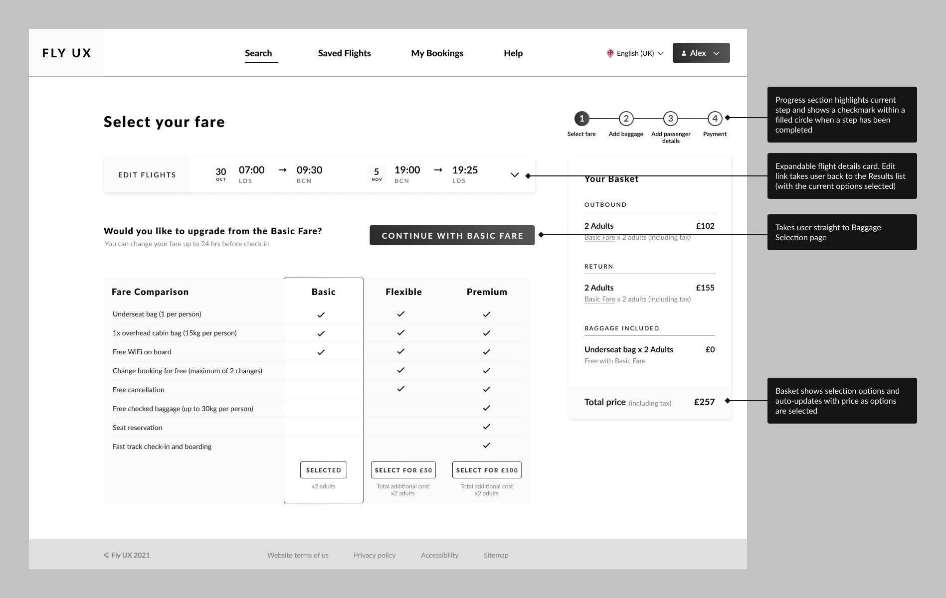
Fare selection confusion
Users couldn't easily and confidently choose the fare type to match their requirements.
Unclear naming and descriptions of fares erode trust in the booking process.
Design response
Clear comparison table with visual indicators for what's included.
Transparent options with clear descriptions and pricing.
Hidden costs frustration
Users were surprised by price increases for baggage and seats, which caused abandonment or restarting the process from scratch.
Users expected transparency.
Design response
Persistent basket showing real-time total price breakdown.
Improved information hierarchy for selections which incur additional costs.
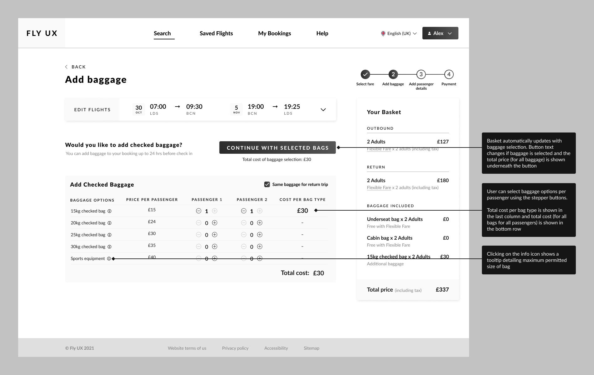
Complex baggage options
Lack of clarity and flexibility around baggage selections especially for journeys with multiple passengers.
Many users found it easy to make incorrect selections.
Design response
Simple stepper controls with clear weight limits and pricing.
Clear options around selections for multiple passengers or differing requirements per journey leg.
Progress uncertainty
Users couldn't tell how many steps remained.
There was uncertainty and a lack of trust in the system re: whether it was possible to go back and edit without losing progress.
Design response
Progress indicator showing all steps, current position, and completed stages (even when navigating back).
Design
Flow Diagram
I started by mapping the entire user flow from search to confirmation, documenting decision points and error states to identify potential points of friction and edge cases early.
Wireframes & Testing
I created low-fidelity wireframes focusing on the information hierarchy and tested them with users before moving onto higher-fidelity designs. Based on user interviews, I prioritised clarity over minimalism, showing all necessary information upfront at key points rather than hiding it.
Key Design Solutions
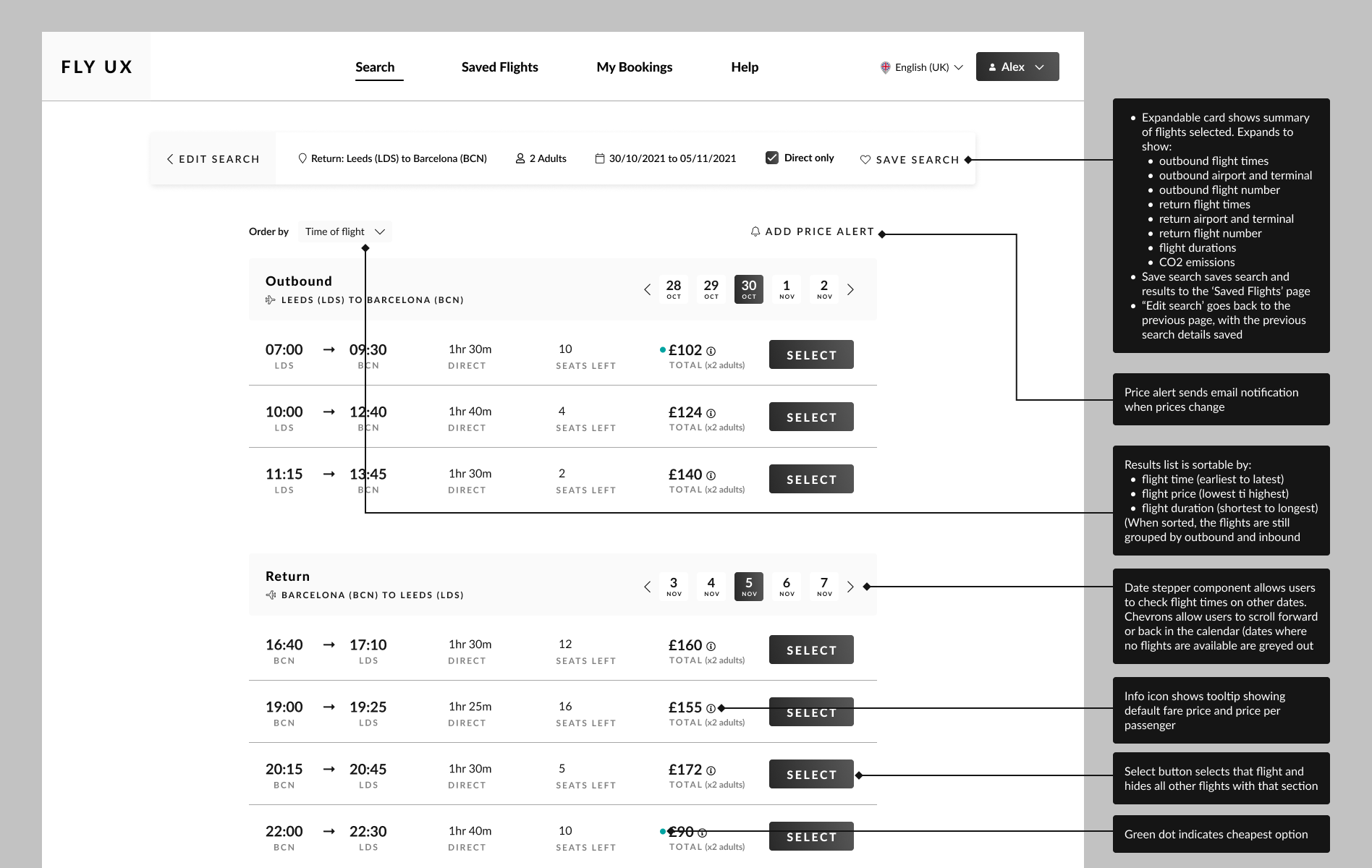
- Real-time price transparency: a persistent basket that updates immediately as users make selections. The total price is always visible and is broken down by category (flights, baggage, seats), so there are no surprises at checkout. Transparent pricing throughout lets users make informed decisions and feel in control.
- Simplified fare comparison: a three-column comparison table with checkmarks showing what's included at each tier. The visual hierarchy makes the most popular fare obvious while allowing easy comparison. Users can scan quickly to understand fare differences without reading dense text, reducing cognitive load.
- Clear progress indication: a stepped progress indicator showing all stages with the current step highlighted and completed steps checked allows users to quickly see where they are and what's left.
- Intuitive baggage selection: a simple per-passenger stepper instead of complex tables. Users can select the number of bags with weight limits and costs shown clearly (with the basket updating in real-time). The stepper pattern is familiar and immediately understandable.
Higher-Fidelity Design
Once the basic structure was validated, I created higher-fidelity mockups following established booking patterns whilst implementing improvements that came out of my research. As feedback indicated a large amount of information, whilst necessary for transparency, could be overwhelming, I focused on visual hierarchy to make primary actions obvious.
Key Learnings
Through this project I gained more experience in conducting a structured research process, and saw how spending time analysing and processing the research data before jumping into wireframes (and instead of conducting these two tasks side-by-side), can lead to a more effcicient design process and save time in the long-term.
Watching real users interact with booking flows was eye-opening and revealed behaviours I hadn't anticipated, for example skipping over selections or information I thought was obvious. This highlighted to me the importance of continually testing designs, as that what is obvious to the designer (especially in the middle of the project when they are deeply familiar with all the options being presented) may be completely missed by users, especially when they are focused on completing a task quickly.
Flight booking is complex, potentially with multiple passengers, different fare types, add-ons, payment options etc. Good UX doesn't eliminate this complexity, but it presents information and options in a way that is predictable and digestible. A large part of the design challenge for this project involved ensuring the information was visible enough, with enough options to give the required flexibility, but without overwhelming the user. My research showed that users expect certain patterns in flight booking, and this can help with reducing cognitive load by leveraging familiar mental models.